
Foxtails Case Study
Project Overview
PROJECT DURATION: July 2022 - August 2022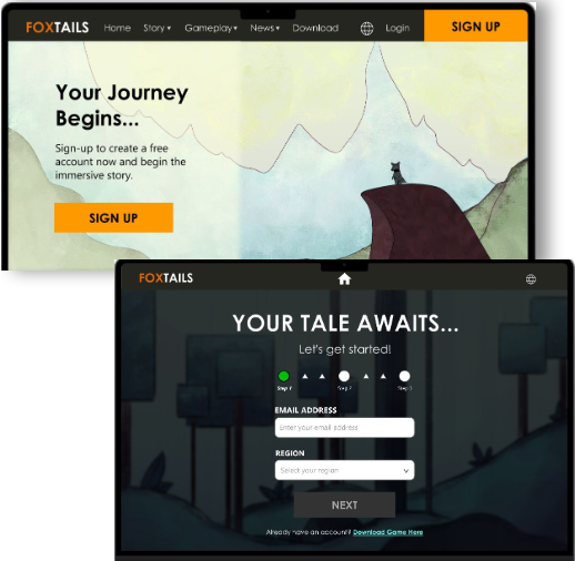
Product Description
Foxtails is a 2D online game from an indie gaming studio. Their typical users are between 13-25 years old, with most users identifying as high school or college students. The studio’s goal is to introduce their game to new users in a fun, quick, and simplistic manner through their website.
The Problem
Current online gaming websites have overwhelming web designs, confusing navigation systems for browsing through what their game offers, and a lengthy sign-up process.
The Goal
Design the Foxtails’ website to be user friendly by providing clear navigation and offering a simple and quick sign-up process.
My role
UX designer leading the Foxtails’ game website design — from conception to delivery.
Responsibilities
Conducting user interviews
Paper and digital wireframing
Low and high-fidelity prototyping
Conducting usability studies
Accounting for accessibility
Iterating on designs
Responsive design
Understanding the User
User research
Personas
Problem statements
User journey maps
User Research - Summary
First, I conducted user interviews, which I then turned into empathy maps to better understand the target user and their needs. I realized many of the targeted demographic are generally curious but cautious when browsing information of a game that interests them.
However, many online game websites are overwhelming and confusing to navigate through, which frustrated many target users. This frustration leads to users not learning what the game is about, which in turn, dissolves their interest in signing-up for an account and downloading the game.
User Research - Pain points
1) Navigation
Game website designs are often flashy and overloaded with information, which results in confusing navigation
2) Accessibility
Online game websites are designed with little to no accessibility features in mind
User Persona

User Journey Map

I created a user journey map of Jordan’s experience using the site to help identify possible pain points and improvement opportunities.
Starting the design
Sitemap
Paper wireframes
Digital wireframes
Low-fidelity prototype
Usability studies
Sitemap

Difficulty with website navigation was a primary pain point for users, so I used that knowledge to create a sitemap.
My goal here was to make an organized information architecture decisions that would improve overall website
navigation. The structure I chose was designed to make things simple and easy.
Paper wireframes

After laying out the site map, I sketched out initial paper wireframes for the homepage, keeping in mind the user pain points about navigation and experience.
The home screen paper wireframe variations to the right focus on optimizing the browsing experience for users.
Paper wireframes - Screen size variations

Because Foxtails users will access the website on other devices, I also designed an additional mobile size with the desktop version to make sure the website would be fully responsive.
Digital wireframes

Moving from paper to digital wireframes made it easy to understand how the redesign could help address user pain points and improve the user experience.
Prioritizing useful button locations and visual element placement on the home page was a key part of my strategy
Digital wireframes - Screen size variation(s)

Low-fidelity prototype
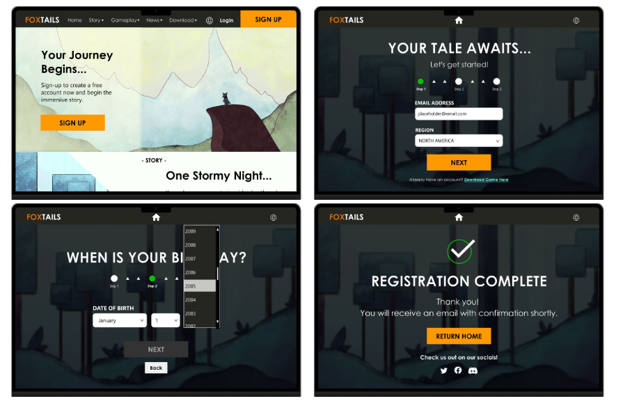
For the low-fidelity prototype, I connected all of the screens involved in the primary user flow of:
Accessing the sign-up process through the home page
Creating a user account
At this point, I had received feedback on my designs from users about things like increasing text font and utilize more of the empty space left. I
made sure to listen to their feedback, and I implemented several suggestions in places that addressed user pain points.
View and interact with the full low-fidelity prototype in the following link here: Foxtails (Low-fidelity)

Animated preview of creating a user account flow on the website
Usability study - Findings
Main findings uncovered by the usability study:
Sign-up CTA — some users had difficulty quickly spotting the CTA button for the sign-up process
Create account (Navigation bar) — users wanted a higher contrast between the home icons from the background to spot it easily
Next / Back CTA - during the sign-up process, users found it difficult to read the “Back” CTA button against the “Next” CTA button
Refining the design
Mockups
High-fidelity prototype
Accessibility
Mockups

To make the sign-up flow even easier for users to click on, I enlarged the “Sign-In” CTA button to pop-out to the user for easier navigation.

During the sign-up process, I added the dark navigation bar from the home page to help establish continuity. I also contrasted the “Next” CTA with the “Back” button by adding different colors and making the button an even shorter length.
Mockups - Desktop screen size
Mockups - Mobile size variation

I had also designed and included considerations an additional mobile screen sizes in my mockups based on my earlier wireframes.
Because users access the site from a mobile devices, I felt it was important to optimize a responsive web design, so users can have the smoothest experience possible.
High-fidelity prototype
My hi-fi prototype followed the same user flow as the lo-fi prototype, addressing feedback and adding design changes made after the usability study.
View the full high-fidelity flow in the following link: Foxtails' high-fidelity prototype

Accessibility considerations
Used sub-headings for different sections of the website page for easier access to users who use screen readers
Used headings with different sized text for clear visual hierarchy and easier navigation
Added a global icon for users who need to access another language apart from English
Going forward…
Takeaways
Impact:
Our target users shared that the design was quick and simple to navigate through the sign-up flow and complete it for registration.
What I learned:
I learned that a good design takes many steps and iterations before it is launched for public use. Most important is to always know even after launch that a site can update again to accommodate our users’ needs.
Next steps
Identify any additional updates needed for the website
Conduct a usability study on new updates for website design
Thank you!
Thank you for your time reviewing my work on the Foxtails’ website! If you’d like to
see more of my work, consider checking out the project pages below:


