Bright Meals - Case Study
Project Overview
Project Duration: September 2022 - December 2022

Product Description
Bright Meals is a meal kit company that provides a subscription-based delivery service to their customers. Their user base consists of young adults, typically between ages 25-30. The company wants to provide their users accessibility to fresh ingredients to make healthier meals into their busy week.
The Problem
Bright Meals recently notice that users who identify as university students drop their memberships because of budget issues. The company wants to promote a new student membership to this user demographic that provides a more budget-friendly subscription plan.
The Goal
Promote the new student plan membership to Bright Meals’ student user base by providing a seamless and clear navigation to the sign-up process.
My role
Lead UX Designer for Bright Meals (mobile app and desktop/mobile website) — from conception to delivery.
Responsibilities
User research
Wireframing
Prototype design
Conducting user testing
Re-iterating on designs based on user feedback
Understanding the User
User research
Personas
Problem statements
Competitive audit
User Research - Summary
I approached users in the target demographic (ie, university students) and conducted interviews to understand their opinions and feedback on meal kit websites. I recognized a common trend that most of these users cancel their memberships because they can no longer afford a standard membership. Other feedback from users included that they did not understand what a membership offered or were not provided clear information before being taken to the payment page. This lead users to becoming frustrated with signing up for a subscription plan with Bright Meals’ and dissuade them from continuing to the final registration
User Research - Persona(s) and Problem statements

Problem statement: Nathaniel is a busy university student studying for his masters’ degree who needs an easy app experience to order fresh and prepped ingredients because he doesn’t have time to go to the grocery and have the energy to cook by the time he gets home.

Problem statement: Landon is a single university student studying for his bachelors’ degree who needs an app that provides student offers / discounts for a mealkit plan because he doesn’t have a high amount of income to provide him with better ingredients or healthier meals.
Competitive audit

Research into competitors mainly target adults in their late 20s to 30s with full-time careers and may be too busy to shop for own ingredients and cook for themselves.
Starting the design
Paper wireframes
Digital wireframes
Low-fidelity prototype
Usability studies
Paper wireframes

For my paper wireframes sketches, I explored a few different ways to how the student plan promotion would appear for the user. Routes A & B (seen here) were the most popular during user feedback.
Though Route A seemed to be the more integrated design, concerns of having to implement and program a new design section were raised. Therefore, Route B felt the more efficient choice to implement while still accomplishing the objective to draw users’ attention to the new promo.
Paper wireframes - Desktop variation

Paper wireframe sketches for desktop version layout to accommodate responsive web design. Though there is more information displayed on the homepage (compared to Bright Meals’ app version), the idea to have a pop-up animation remained the same in the web versions.
Digital Wireframes
Implementing the sketch design to digital wireframes made it easier to read how the student plan promotion would animate into the frame:

By greying out the background in order to contrast the promo popping up into the screen helps draw the user’s eye immediately towards the bottom.
Digital wireframes - Screen size variation(s)

Digital wireframe - Desktop responsive design
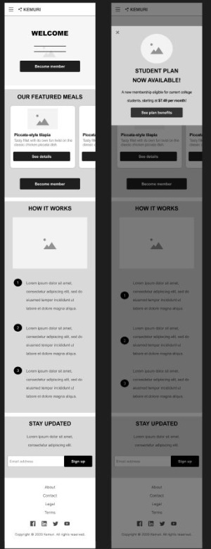
Digital wireframe - Mobile (web) responsive design
Low-fidelity prototype
For the first version of the app’s low-fidelity prototype, I implemented the primary user flow of clicking on the plan promotion CTA, leading to the sign-up page that lets users subscribe to Bright Meals’ membership.
For this path, I wanted to convey the plan to the user and lead them through the sign-up process with as little as confusion as possible by making the experience clean and straightforward.
View Bright Meals’ low-fidelity prototypes in the following respective links:

Animated preview of low-fidelity mobile app version
Usability study - Findings
Main findings uncovered by the usability study were:
Visual hierarchy — Establish cleaner visual / text hierarchy to help highlight important information
Provide more information — Some users felt the student plan was lacking information and did not understand the full benefits of the membership
Add sign-in / create an account page into user flow - Users questioned if they needed an account or a way to sign-in to continue into the payment flow
Refining the design
Mockups
High-fidelity prototype
Accessibility
Mockups

I designed a frame in the mobile app to help highlight the student plan membership benefits to the user in a more concise manner.
After conducting the usability study, the hi-fidelity version was then refined to look less divisive by removing the borders. Icons were added to help complement the worded information.

Originally, there was no indication that the user needs to already be logged into an account before signing up for a subscription plan. The low-fidelity mockup version then felt out of place to users, unsure whether they should continue or not. The hi-fidelity was then re-designed to feel more familiar and straight-forward by designing it into a login page and adding a notice at the top to indicate the user needs to be signed in before continuing to the subscription page.
Mockups - Mobile app version

Mockups - Desktop web version

Mockups - Mobile web version

High-fidelity Prototype
Shown below are the links to the final high-fidelity prototypes for each version. A happy flow for these prototypes would prompt a new offer to our targeted users and have them buy the student plan in an effortless process.
View all of Bright Meals’ high-fidelity prototypes in the following respective links:

Animated preview of hi-fidelity flow for desktop (web) design
Accessibility considerations
Use of color — Keeping in mind for users who may be colorblind. Ensure certain visualelements are designed ina way that still prompts them cues in the same manner compared to someone who is not colorblind
Use of headings — Informative and key-worded headings for users who may have limited memory, low vision – they should know the purpose of each section through few words.
Consistent Navigation — Repeated components are consistent and stay in the same order to help users predict where they can find things on each page.
Responsive Design

Responsive designs for desktop to mobile. When I was approaching the design for desktop, I wanted to keep in mind with how it would
look condensed down to the mobile size – in that sense, I wanted to have the main desktop layout more centered to make the transition more seamless.
Going forward…
Takeaways
Impact:
Testing users who identified as university students felt more assured of how the new student plan membership was promoted to them – making them feel more inclined to sign up with Bright Meals’ membership.
What I learned:
I learned how important it is to consider the design from a user base problem and needs while also knowing how to balance / factor in
underlying obstacles from perspectives of how long would it take for a developer and if the design fits into the company’s client’s vision.
Next Steps
Identify any additional feedback needed for the app / website in order to ensure user’s needs and goals
Conduct future usability studies with new adjustments / implemented feedback in order to make Bright Meals’ as user-friendly as possible
Thank you!
Thank you for your time reviewing my work on the Bright Meals app and website! If you’d like to
see more of my projects, consider checking out the pages below:


